Project Overview
The Core Problem
CASA operates at an uncomfortable intersection. The organization advocates for abused and neglected children moving through the family court system—work that is both emotionally devastating and profoundly important. But the previous visual identity didn't reflect that gravity. It felt generic, nonprofit-by-template, and failed to communicate why someone should volunteer their time to walk into courtrooms and represent children's best interests.
Equally challenging: the brand had to work across completely different stakeholder contexts. Judges needed to see institutional rigor and court-ready credibility. Potential volunteers needed to feel empowered and supported, not overwhelmed by trauma. Donors needed to understand measurable impact. The public needed clarity about the mission itself.
The previous identity couldn't do all of this. So it did none of it particularly well.
Research & Insight Discovery
We conducted stakeholder interviews across five distinct audiences: current volunteers, potential volunteers, judges and court system partners, major donors and foundations, and the public. The consistent insight: people want to help, but they need to know they won't be alone.
Volunteers didn't want inspiration porn—they wanted honesty about the difficulty and clarity about their support systems. Judges wanted professionalism and clear documentation. Donors wanted to see outcomes and understand the ripple effect of their gifts. The public wanted to understand what CASA actually does.
This insight shifted everything. The brand architecture wasn't about being all things to all people; it was about being honest in all contexts, then customizing the register depending on stakeholder.
Visual Identity Strategy
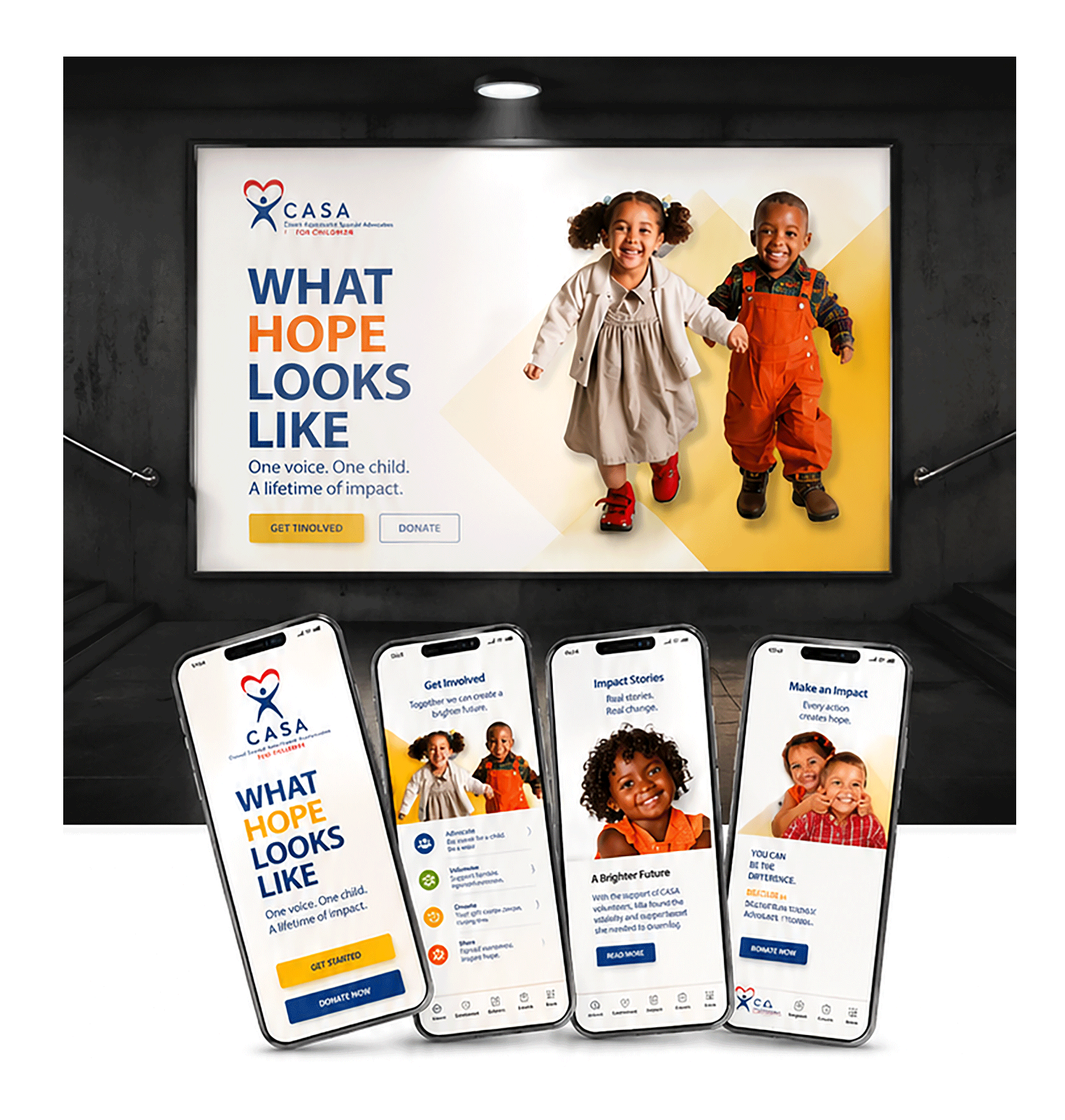
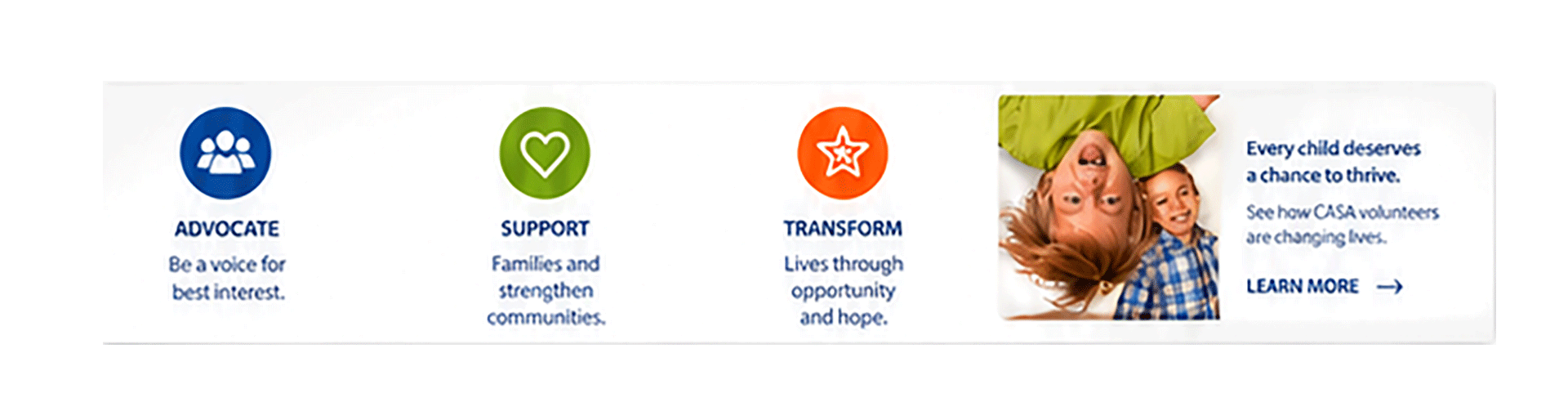
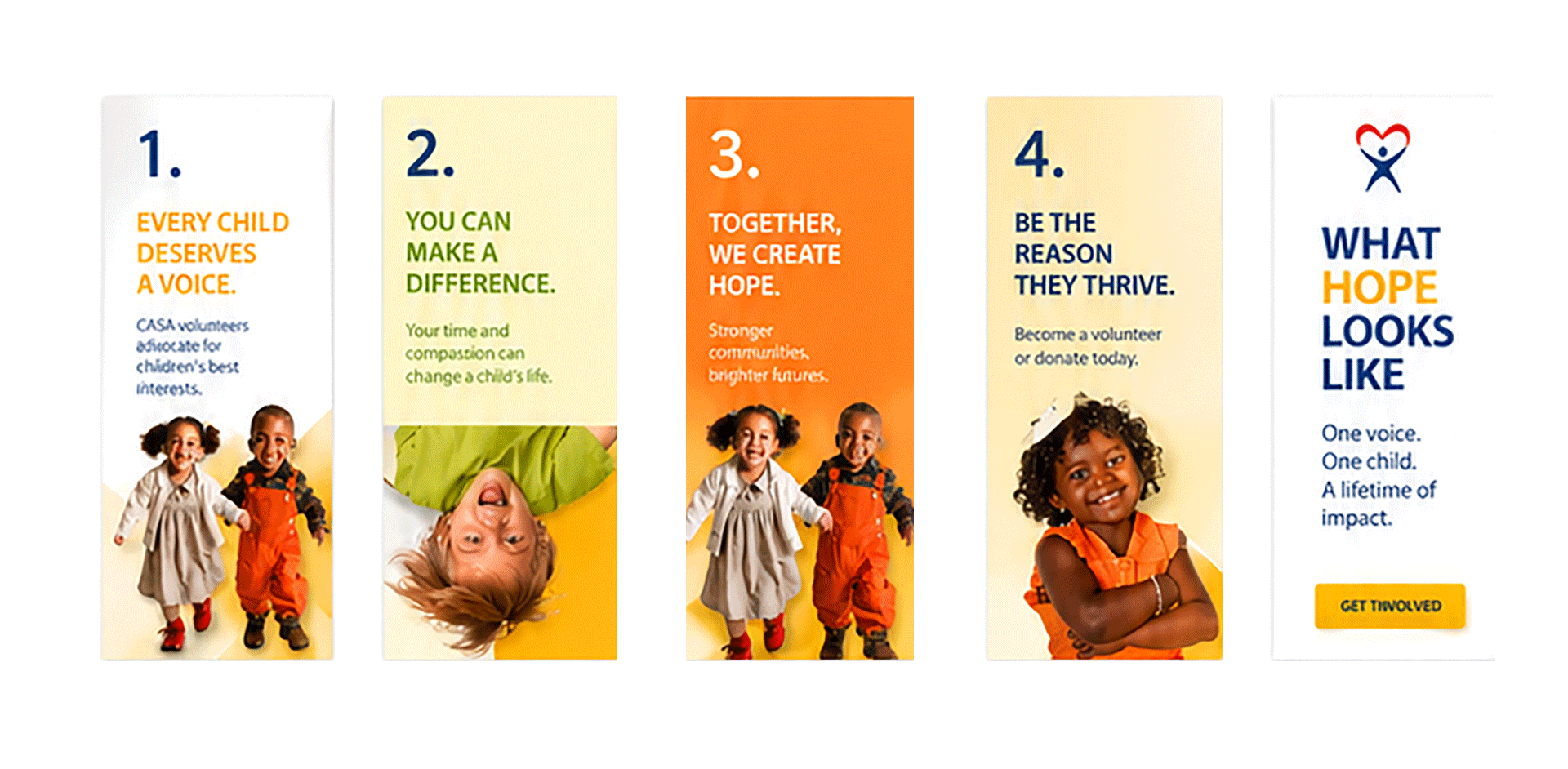
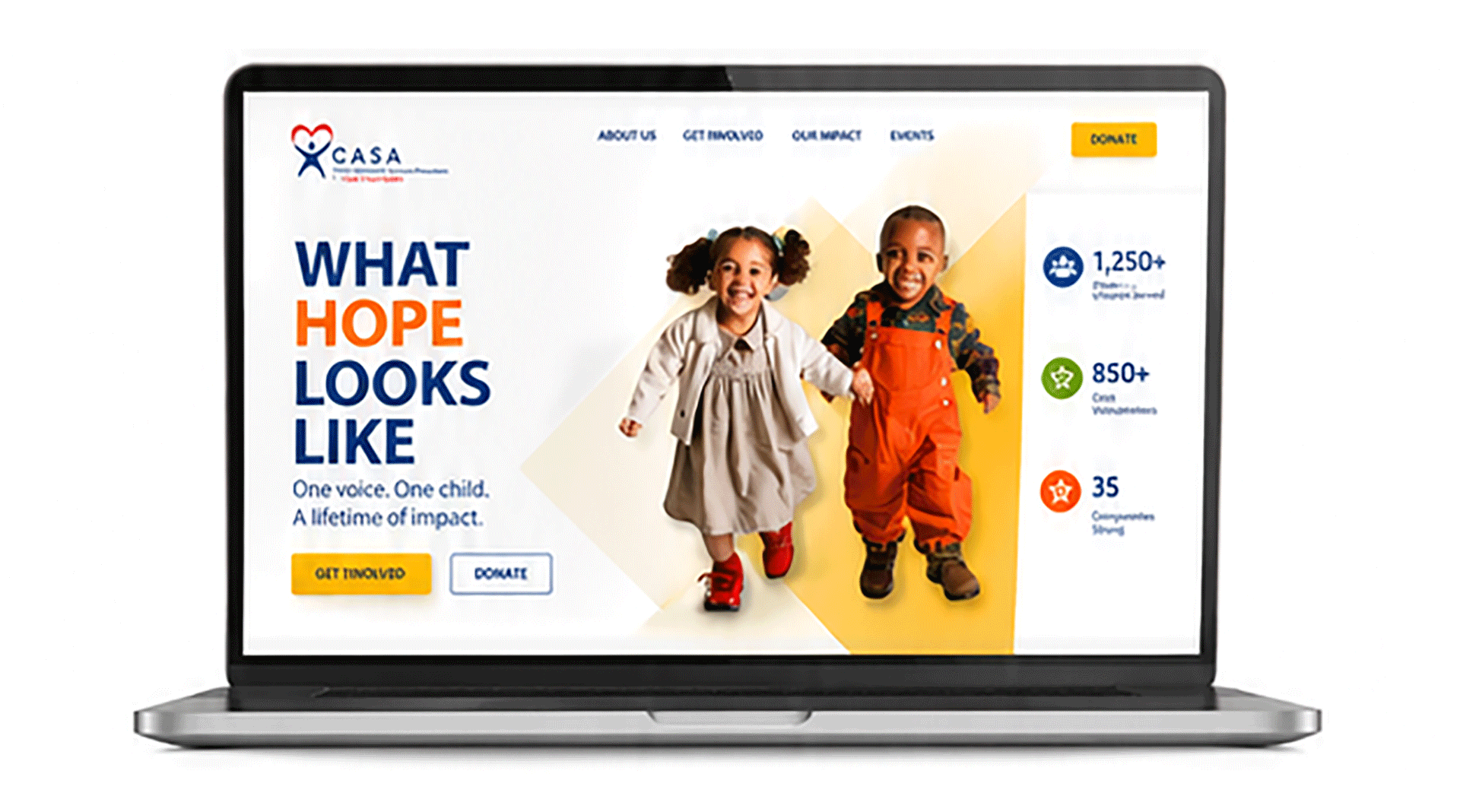
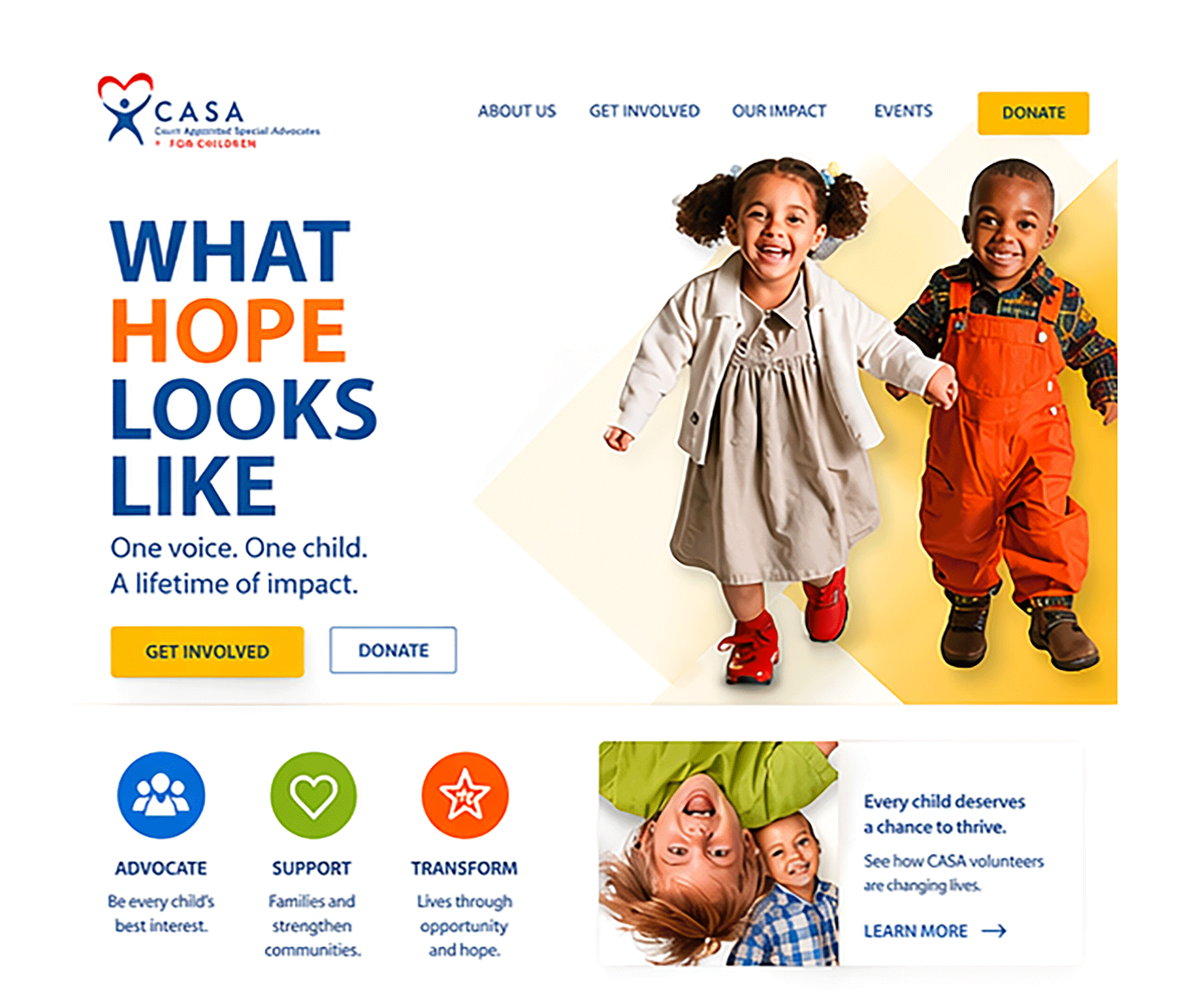
The Mark: The previous logo felt disconnected from the mission. We designed a new mark that incorporated the core tension CASA exists to resolve: the child (centered, protected, grounded) surrounded by advocates (circular, continuous, never-broken). The mark works at every scale—from email signature to courtroom presentation. Every application of the mark subtly reinforces the relationship: the child is never alone.
Color Psychology: Navy for institutional authority, credibility, court-readiness. Red as a secondary accent for urgency and care. But critically, we added warm neutrals and earth tones for materials aimed at volunteers and the public—colors that felt human and grounded, not cold. The palette allowed us to match emotional tone to audience without breaking the system.
Typography Hierarchy: Inter Tight for headlines (confident, modern, accessible to all readers including those with reading challenges). Inter for body text (designed for legibility in printed court documents and digital platforms). The hierarchy was tested with actual court documentation requirements to ensure it met legal standards.
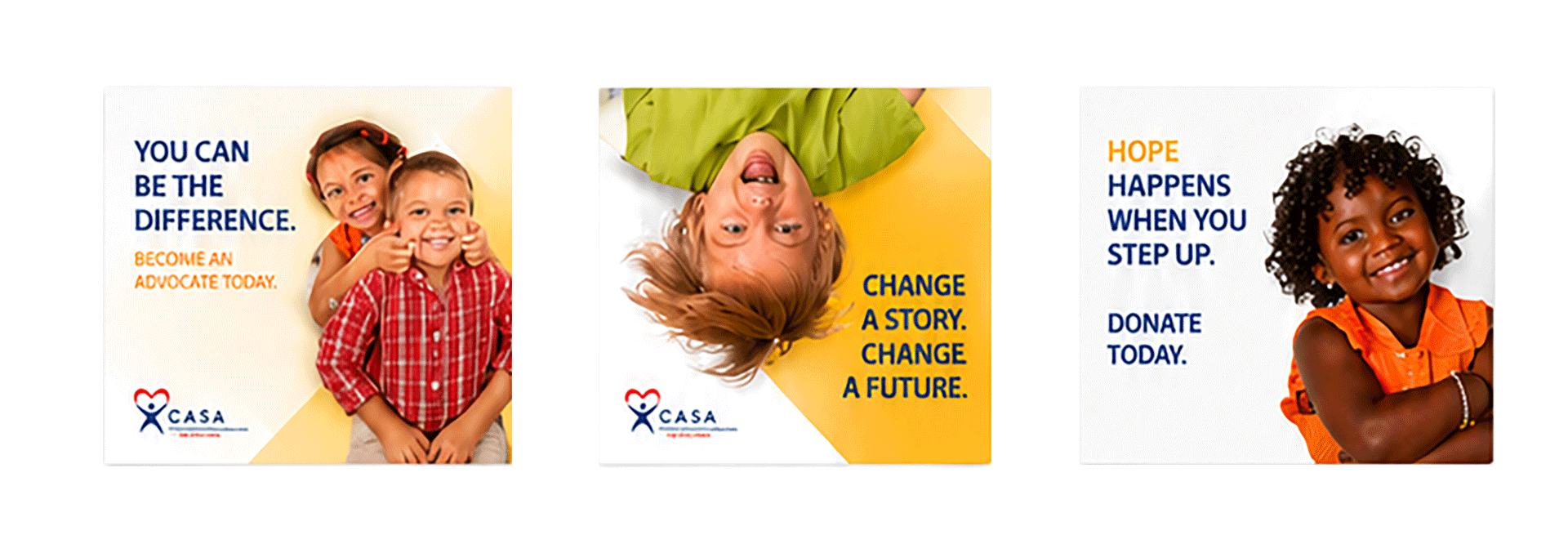
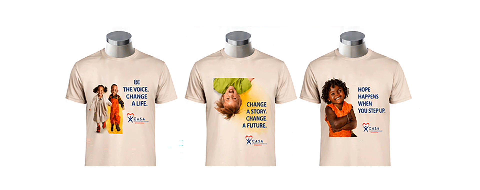
Imagery & Photography: The most critical decision. We established strict photography guidelines: real children and families only (with proper consent and ethical guardrails), genuine moments of connection and support, authentic representation across demographics, and absolute prohibition on exploitative or trauma-centered imagery. Photography became a commitment to dignity, not a tool to manipulate emotion.
The Four Stakeholder Tiers
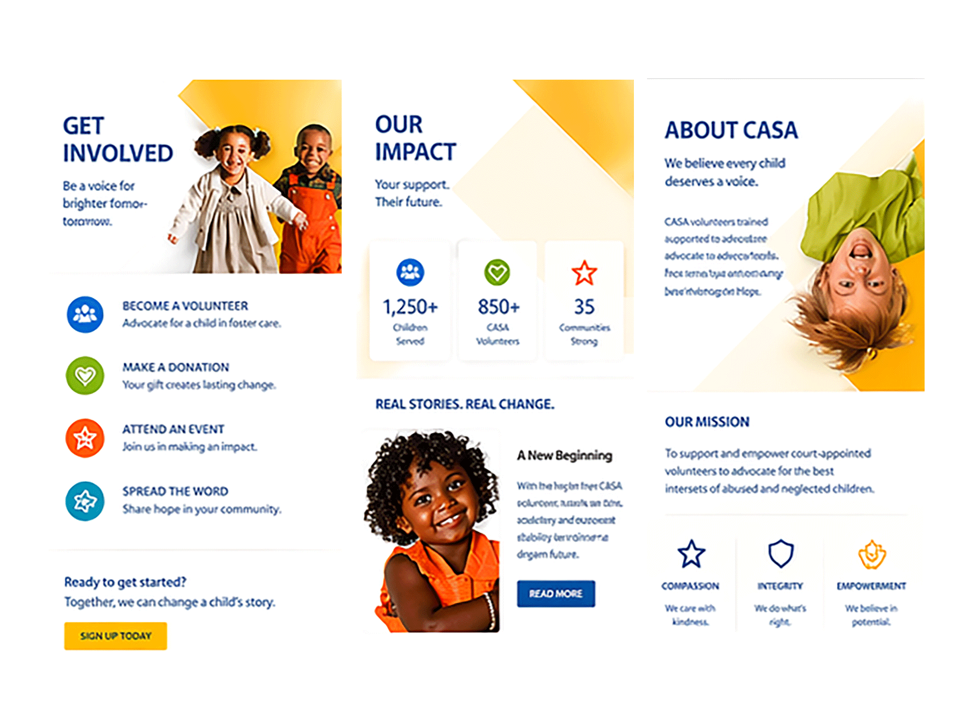
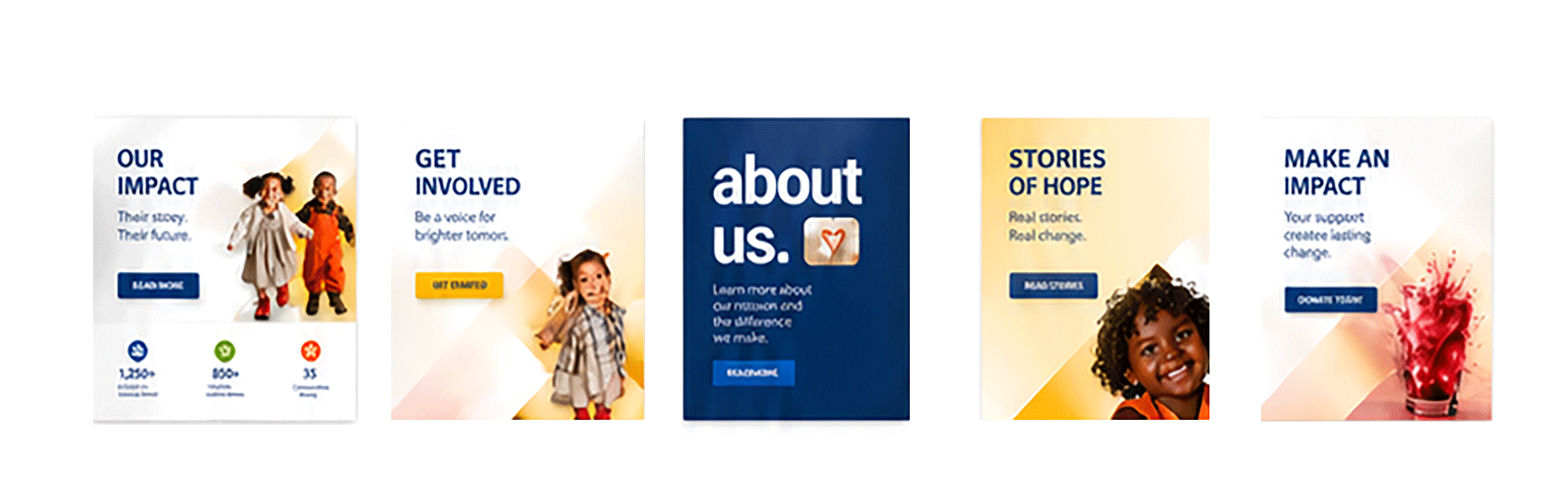
Tier 1 (Court System & Government): Annual reports, court filings, government partnership materials, compliance documentation. Heavy on data visualization, formal typography, navy-forward layouts. This tier had to prove CASA's institutional rigor and measurable impact. These materials needed to look like they came from an organization judges could trust with children's futures.
Tier 2 (Volunteer Recruitment & Support): Volunteer orientation materials, training decks, ongoing support resources, event materials. Warmer color use, human photography, conversational tone. This tier communicated: this is difficult work, and you won't do it alone. Materials emphasized support systems, outlined concrete responsibilities, and celebrated volunteer impact without romanticizing the work.
Tier 3 (Donor & Foundation Engagement): Major donor presentations, annual campaign materials, grant proposals, impact reports. Data-driven design with emotional resonance—showing outcomes not as abstractions but as meaningful change. Color and tone positioned CASA as trustworthy steward of donated resources, with clear accounting of impact.
Tier 4 (Public Awareness & Education): Website, social media, community outreach, PSA materials, educational content. Accessible design, warm positioning, clear explanation of the mission. This tier educated the public about CASA's role in the child welfare system and why volunteer advocacy matters.
System Design & Implementation
Templates & Infrastructure: We built templates for every recurring deliverable: court filings (government-required formatting), volunteer training presentations (PowerPoint and Keynote with built-in data visualization), annual reports (InDesign with flexible data layout), grant proposal templates (Word and Google Docs), fundraising collateral, social media graphics, and website component libraries.
Governance & Guardrails: Each template locked core brand elements (logo, primary colors, typography rules) while leaving messaging flexible. Critical for an organization where different programs, different regions, and different teams all needed autonomy without fragmenting the brand. A volunteer coordinator in Sacramento and a development director in New York could create materials that felt like they came from the same organization.
Ethical Photography Library: We created a curated library of pre-approved photography from actual CASA work—volunteers in courtrooms, children in safe moments, family reunifications, volunteer trainings. Every image had documented consent and ethical clearance. This meant programs could create materials without needing to stage photographs or work with external photographers.
Training & Change Management: The organization deployed a 6-week rollout starting with leadership, then cascading to program directors, then staff. We created quick-start guides for each template tier and a 60-page brand guidelines document. Critical detail: we didn't just hand off materials and expect adoption. We trained the organization on why the system mattered—how consistent branding meant more volunteers, more donors, more court partnership opportunities.
Measurable Outcomes
Within 12 months of full brand deployment: volunteer applications increased 41%, major donor engagement metrics improved significantly (increased gift size, improved retention), three new court jurisdictions adopted CASA (vs. none in the prior year), and brand consistency across all materials reached 96% (measured against brand guidelines compliance). The system remains the organizational standard 4+ years later with only minor refinements.
More importantly: volunteers reported higher confidence and clearer understanding of their role. Judges reported improved professional presentation of materials submitted to court. Donors reported clearer understanding of impact. The public reported better understanding of CASA's mission.